Brief & response
A Ravensbourne brief to rebrand The Co-operative.
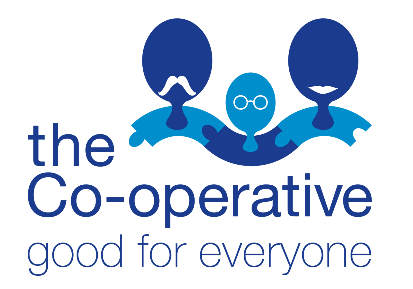
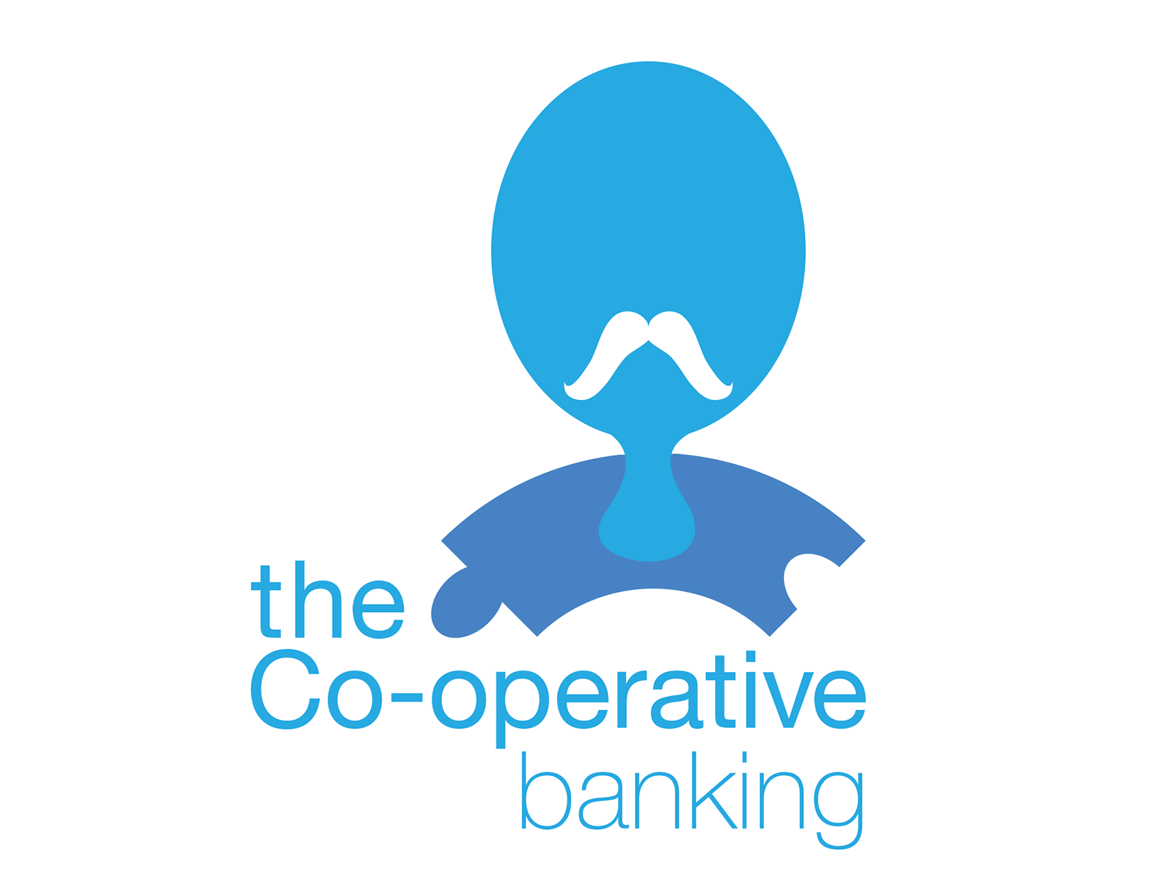
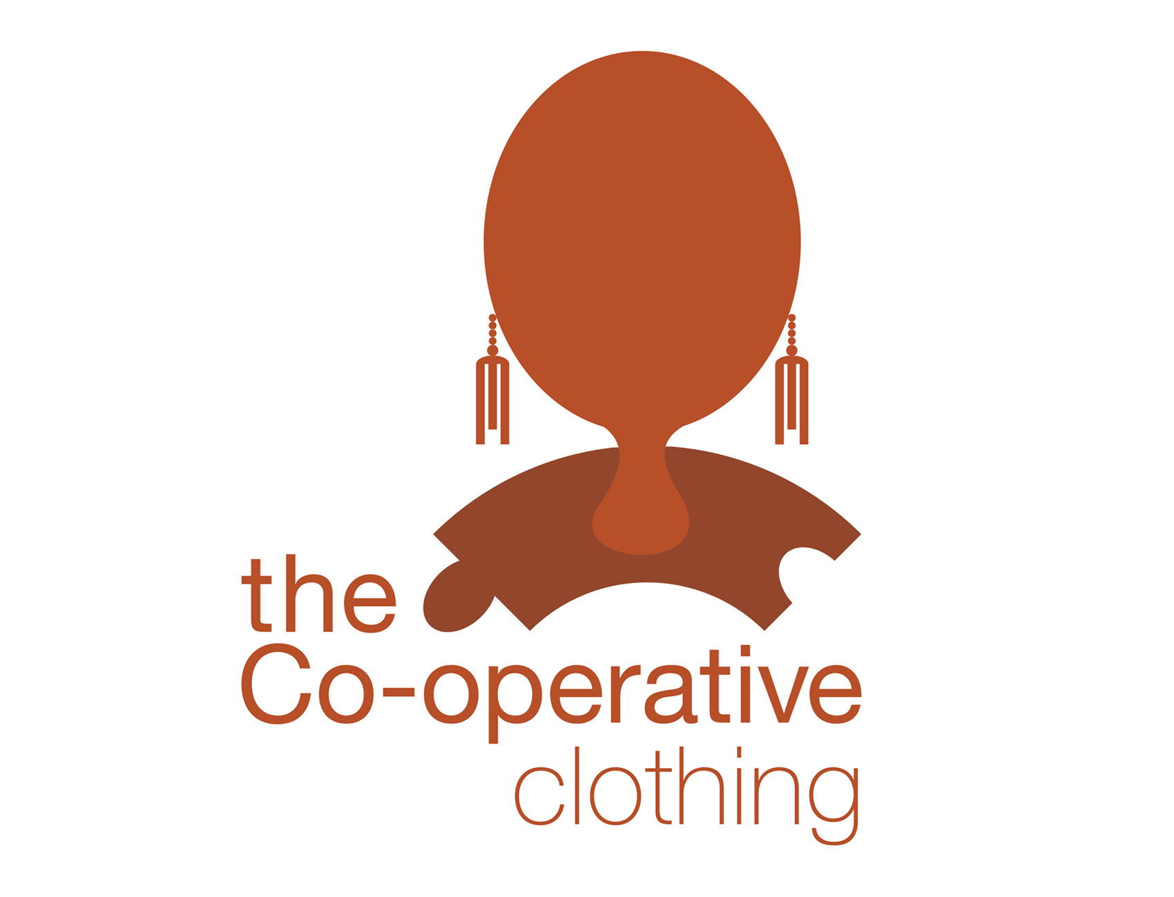
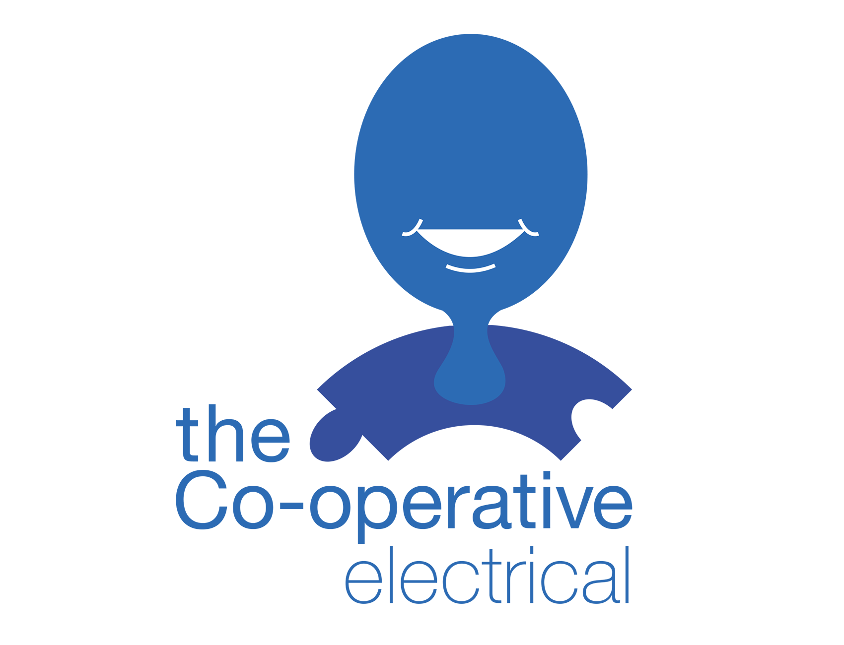
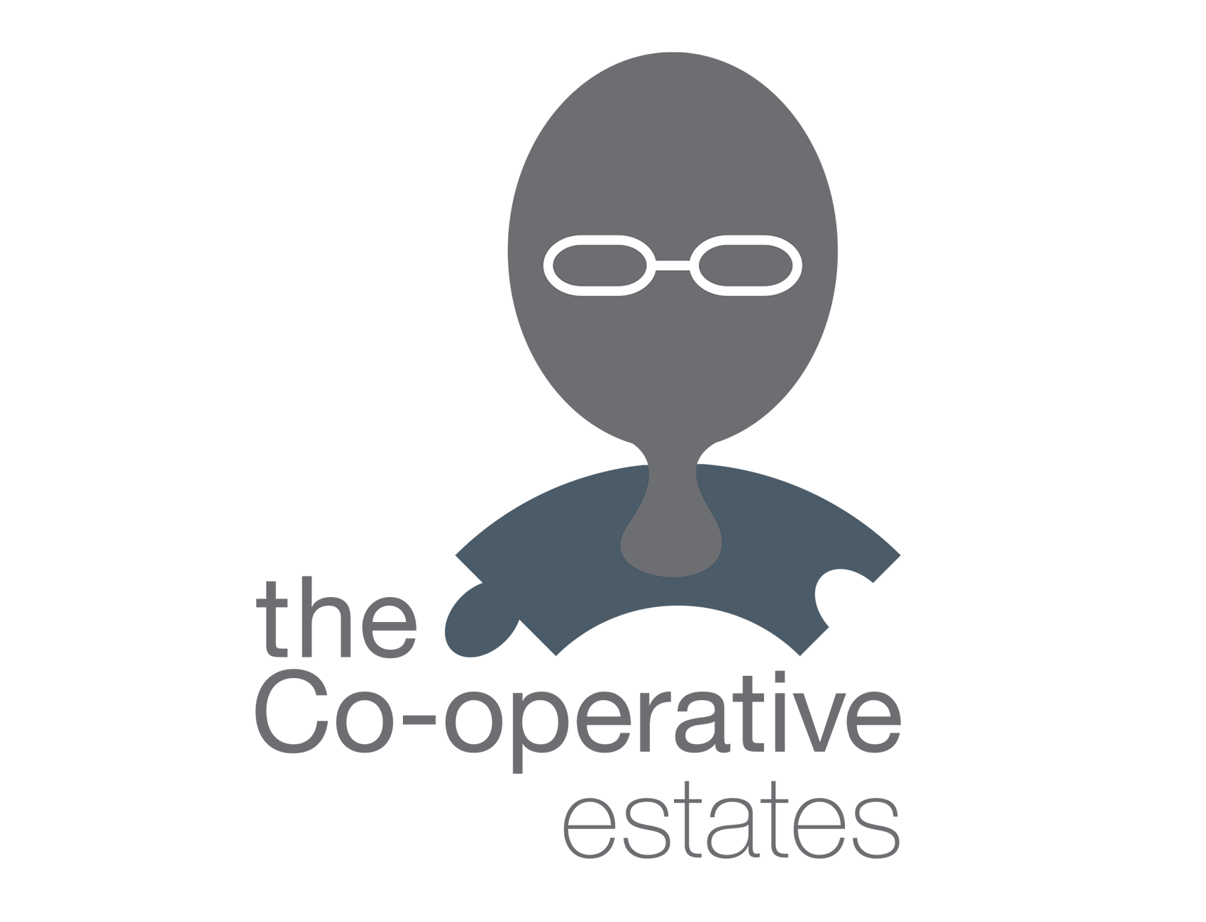
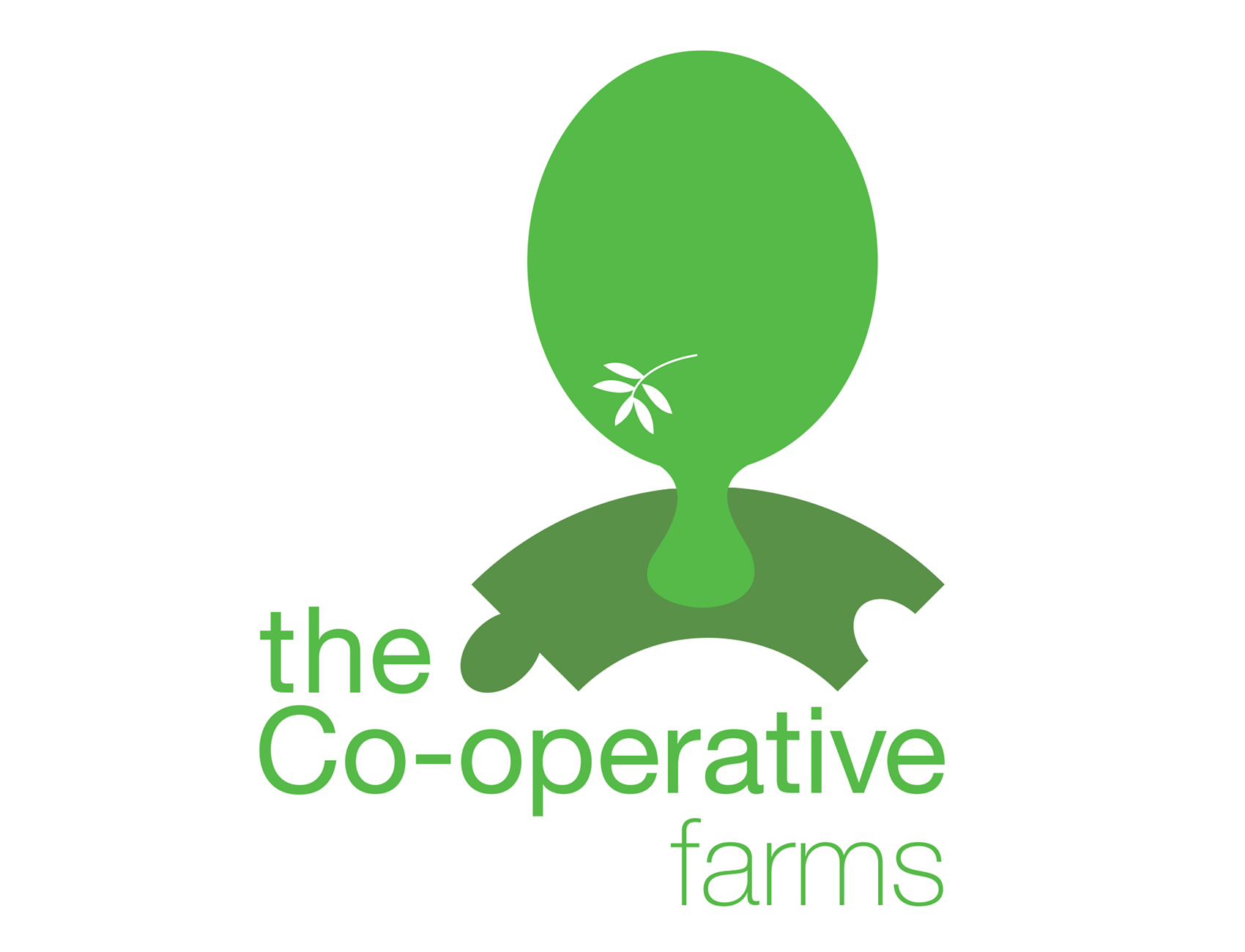
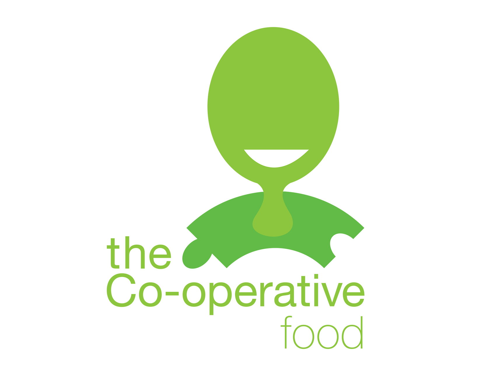
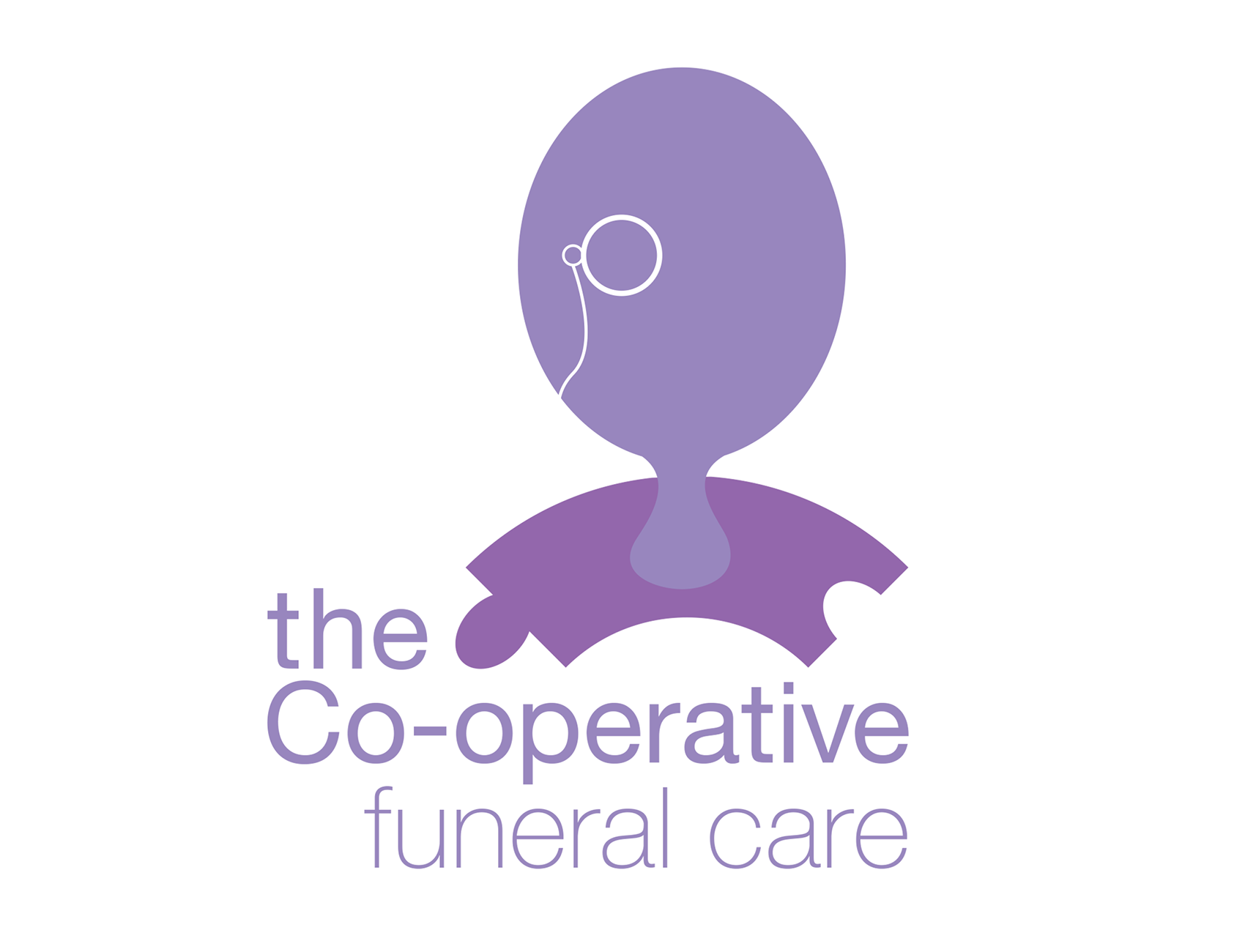
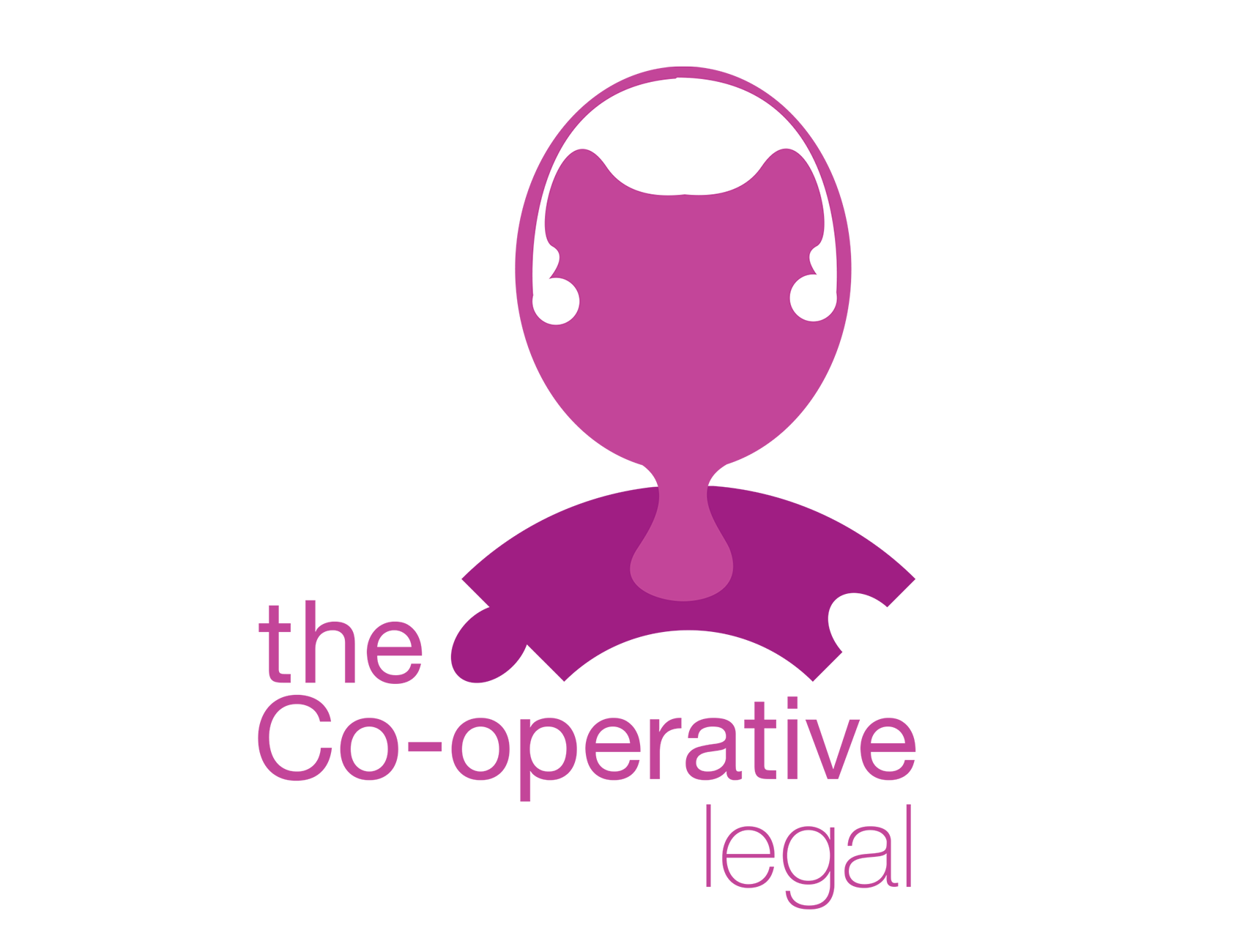
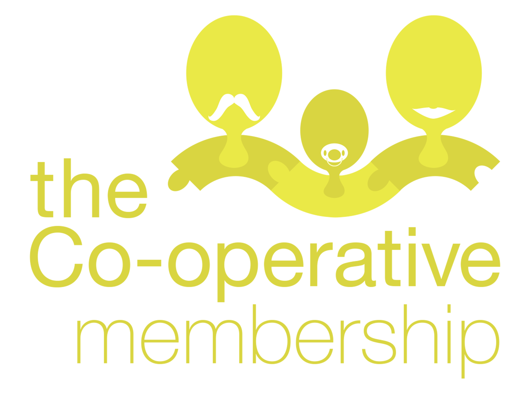
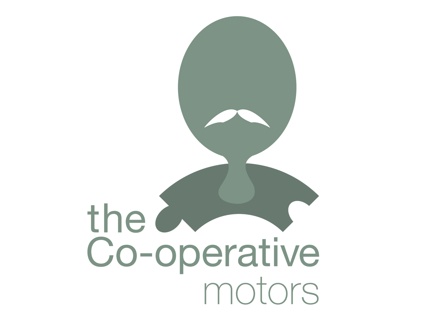
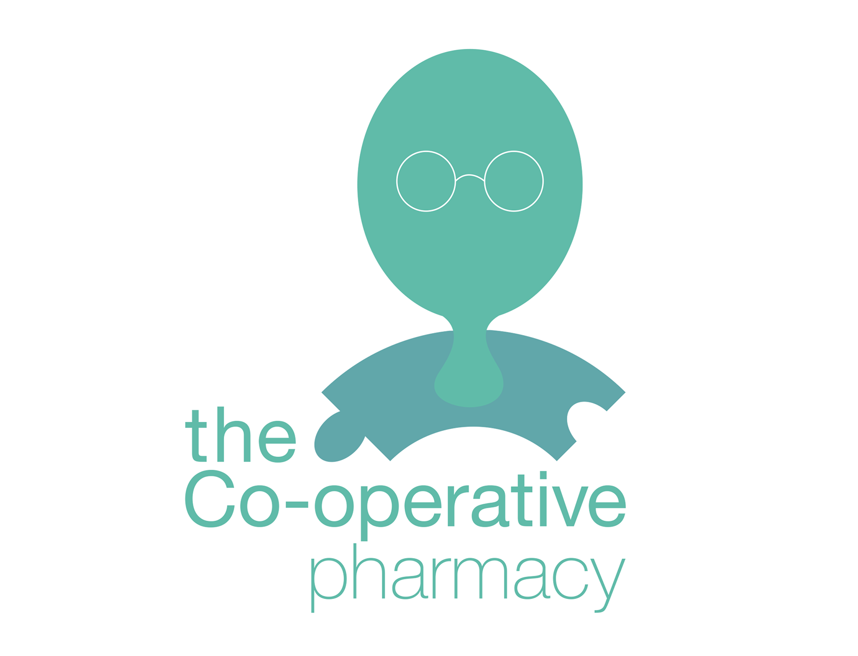
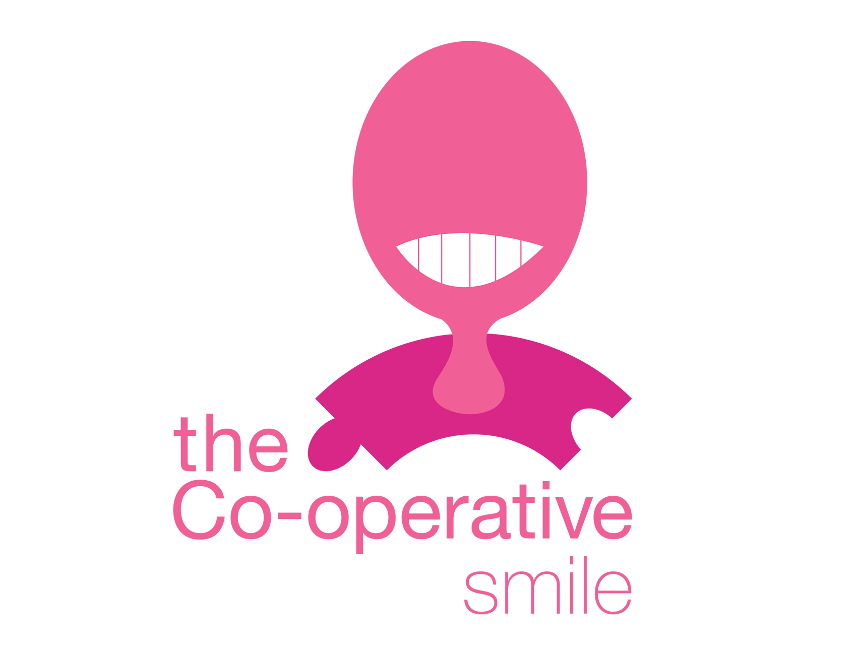
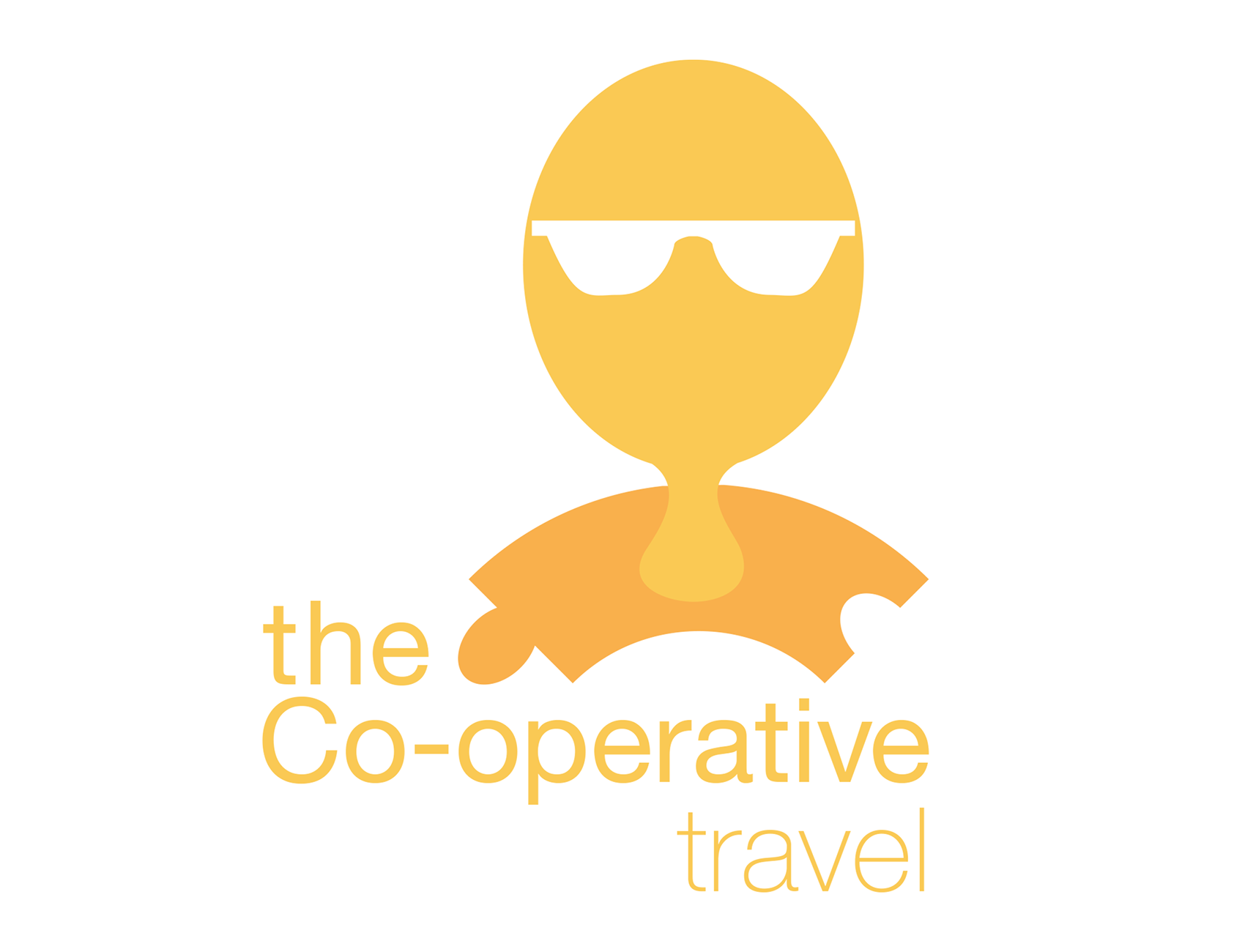
Logos for the rebrand were inspired by paper chains and puzzle pieces to show community and togetherness which is at the heart of the company.
Logos for the rebrand were inspired by paper chains and puzzle pieces to show community and togetherness which is at the heart of the company.
These then had a facial feature, differing across the sub - brands, to bring more personality to the brand and feel more approachable. Each feature related to the sub brand’s sector giving it an individual look to align with how the Co-op is run by individual members and not big investors. As a collective, these then aligned with the company’s catchphrase ‘good for everyone’. A colour for each sector was chosen to add to the individuality of the logos.