Brief & response *project in progress*
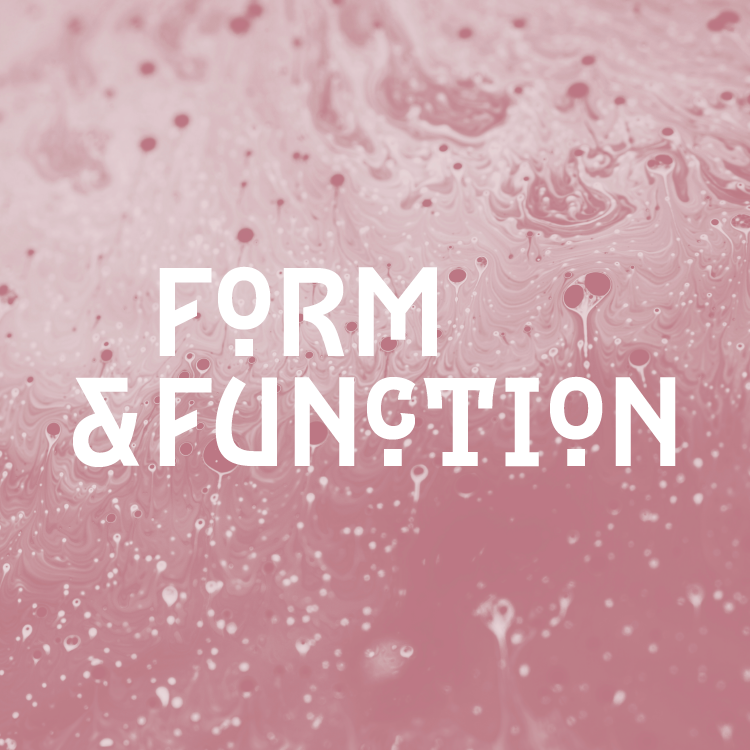
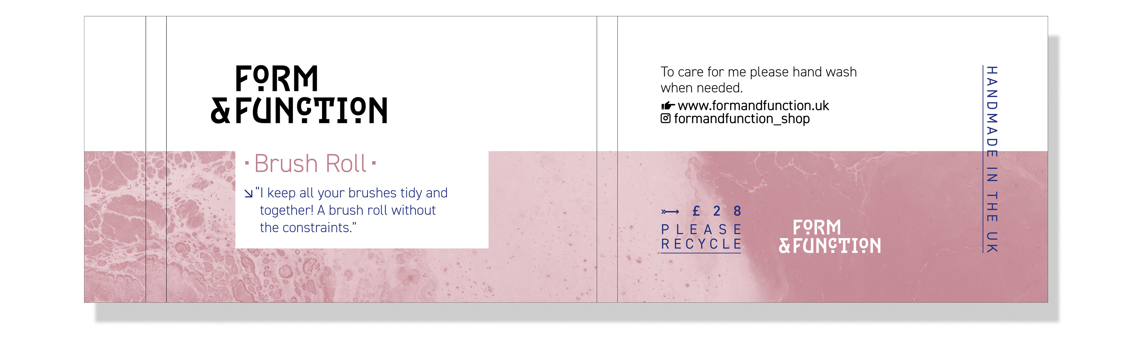
Branding for my start-up business. The branding & logo needed to allow for future expansion so couldn’t relate directly to the first product. It needed to be clean & modern. Form & Function was named after the expression ‘form follows function’, the businesses products were designed to be strong in both form & function.
The idea of this formed the concept behind the brand.
The idea of this formed the concept behind the brand.
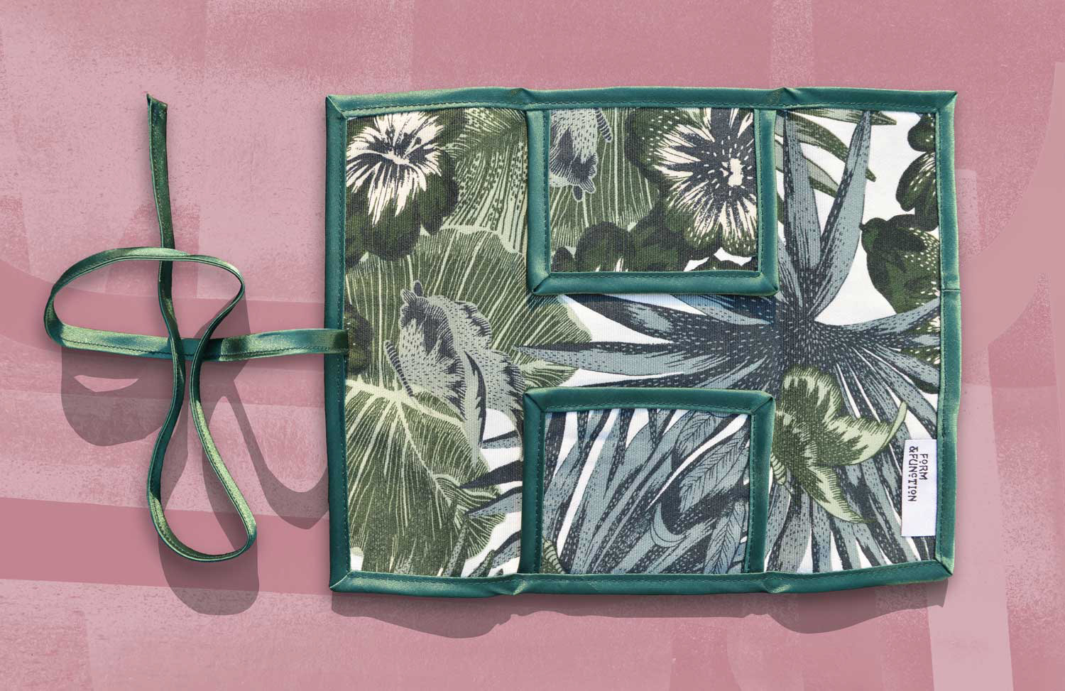
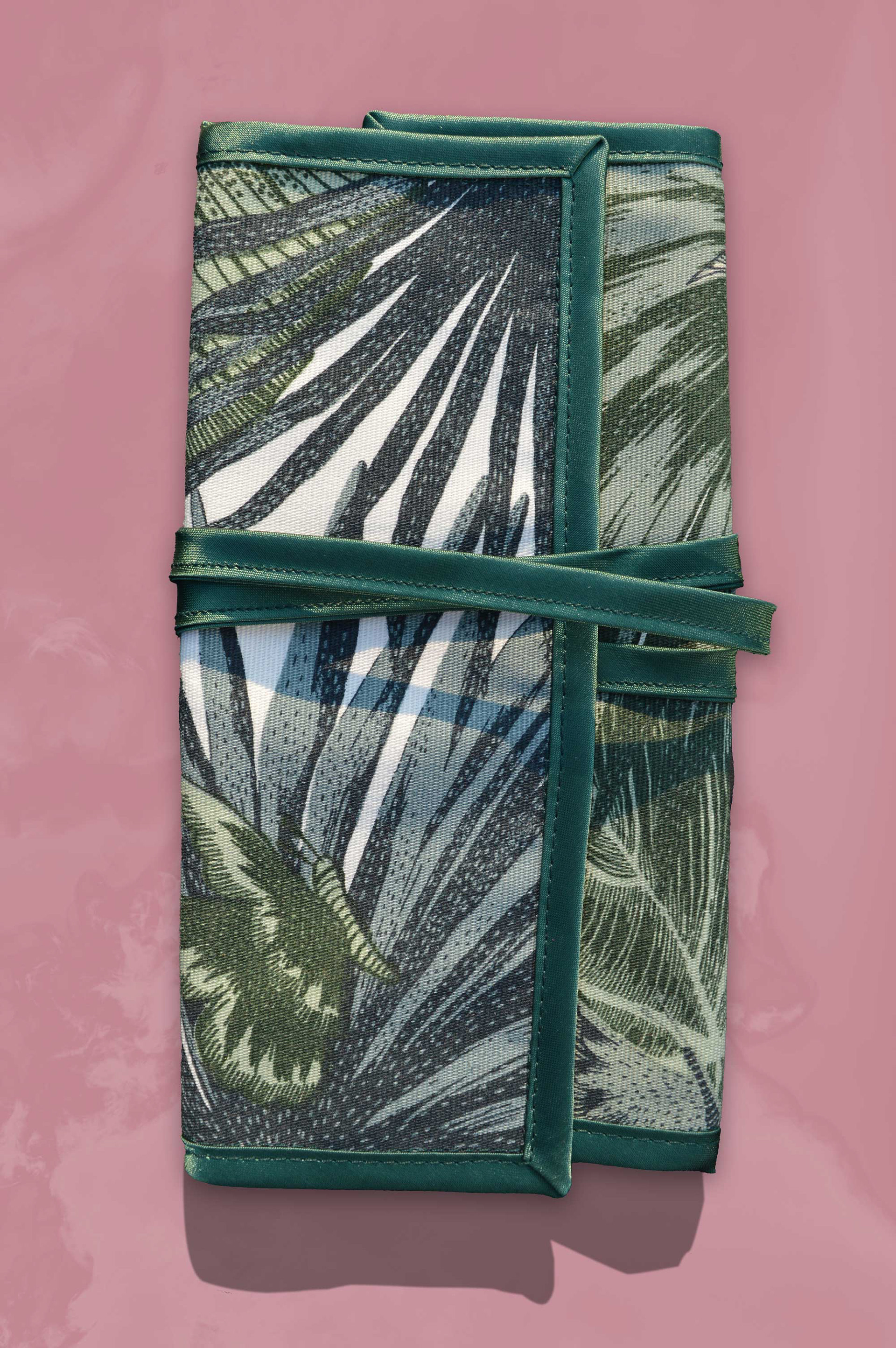
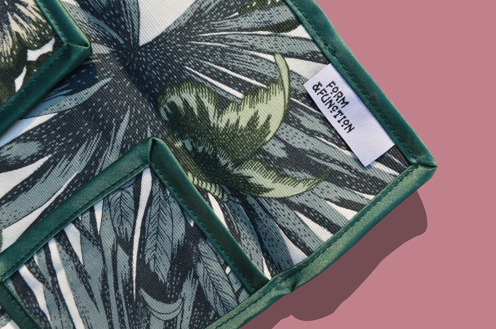
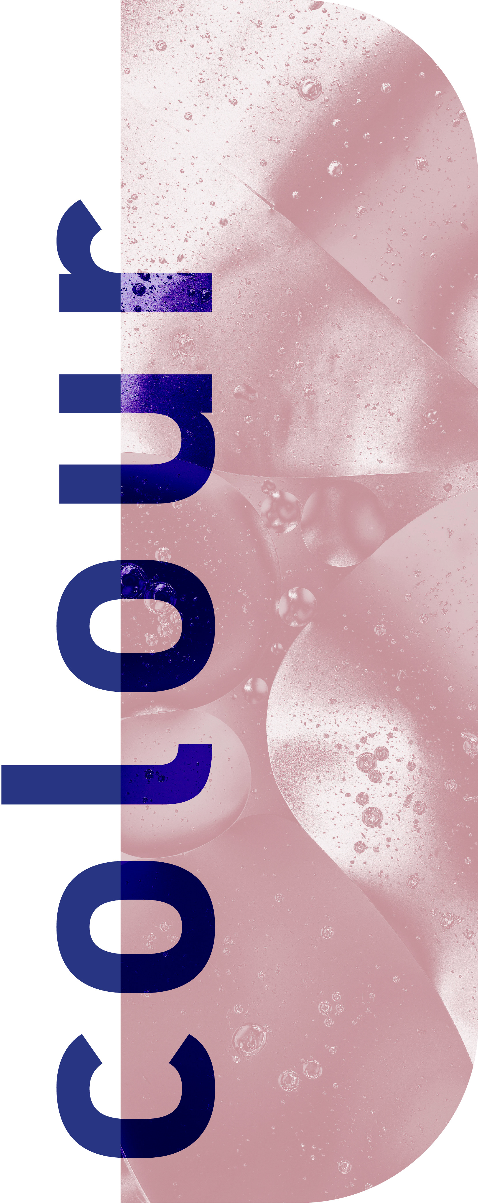
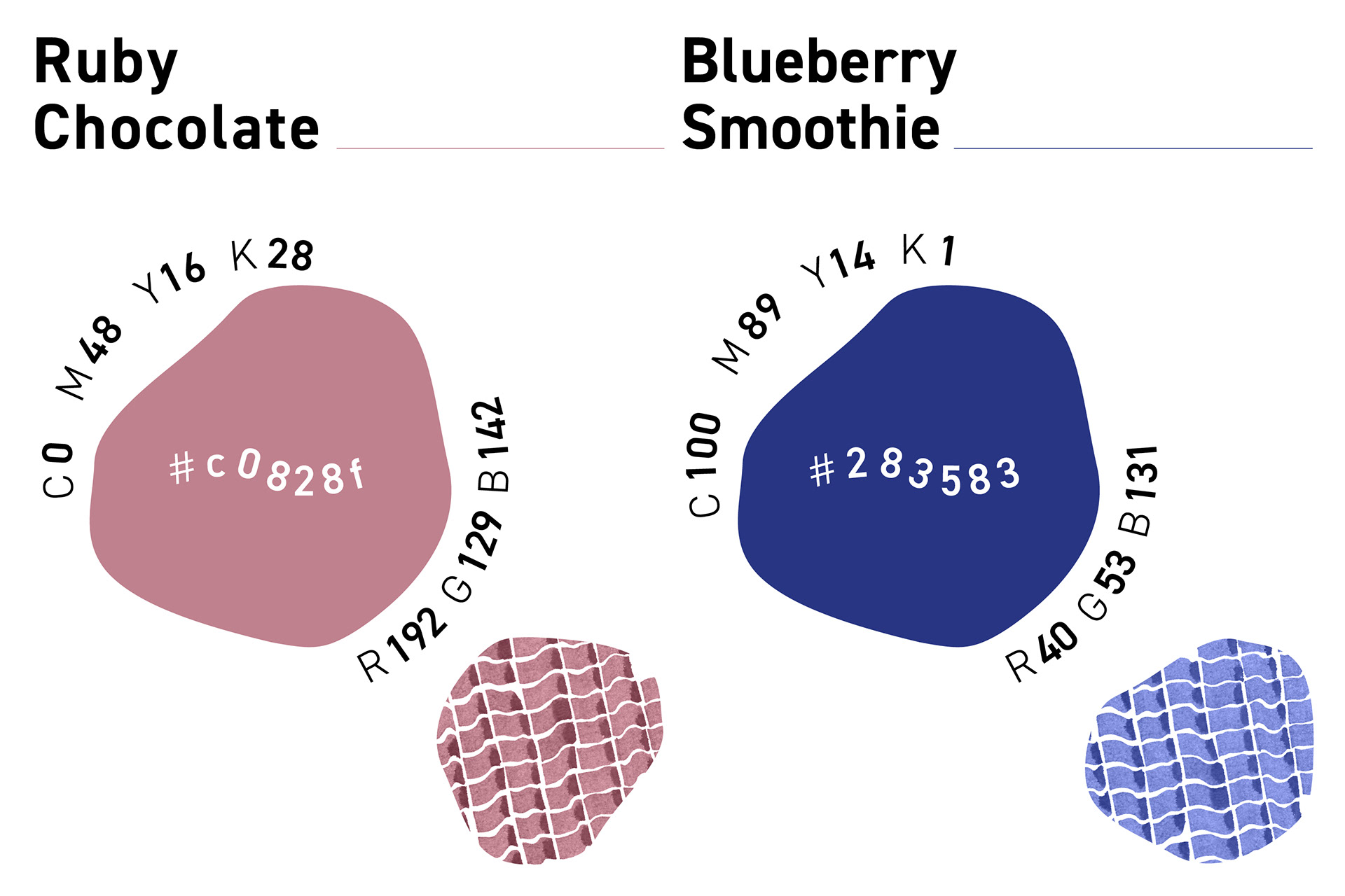
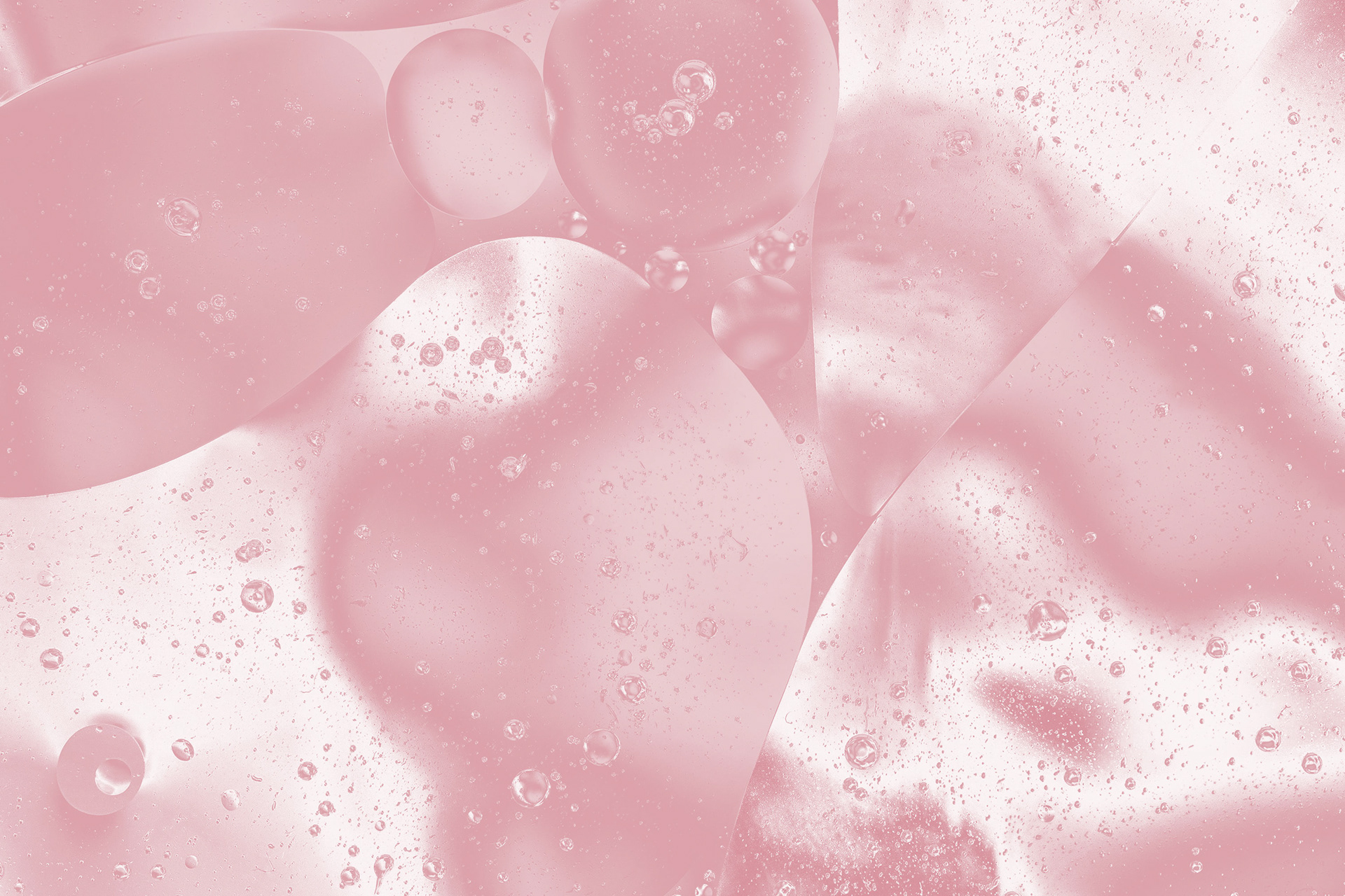
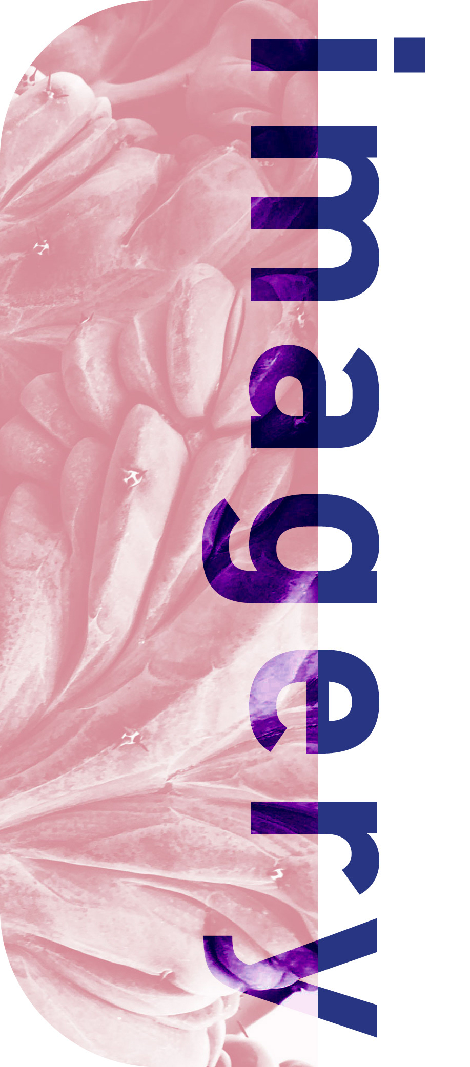
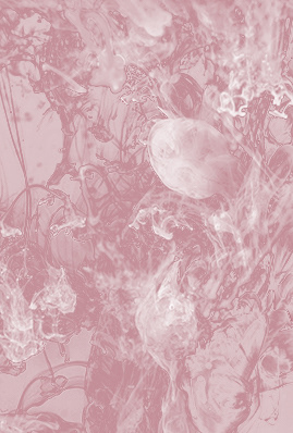
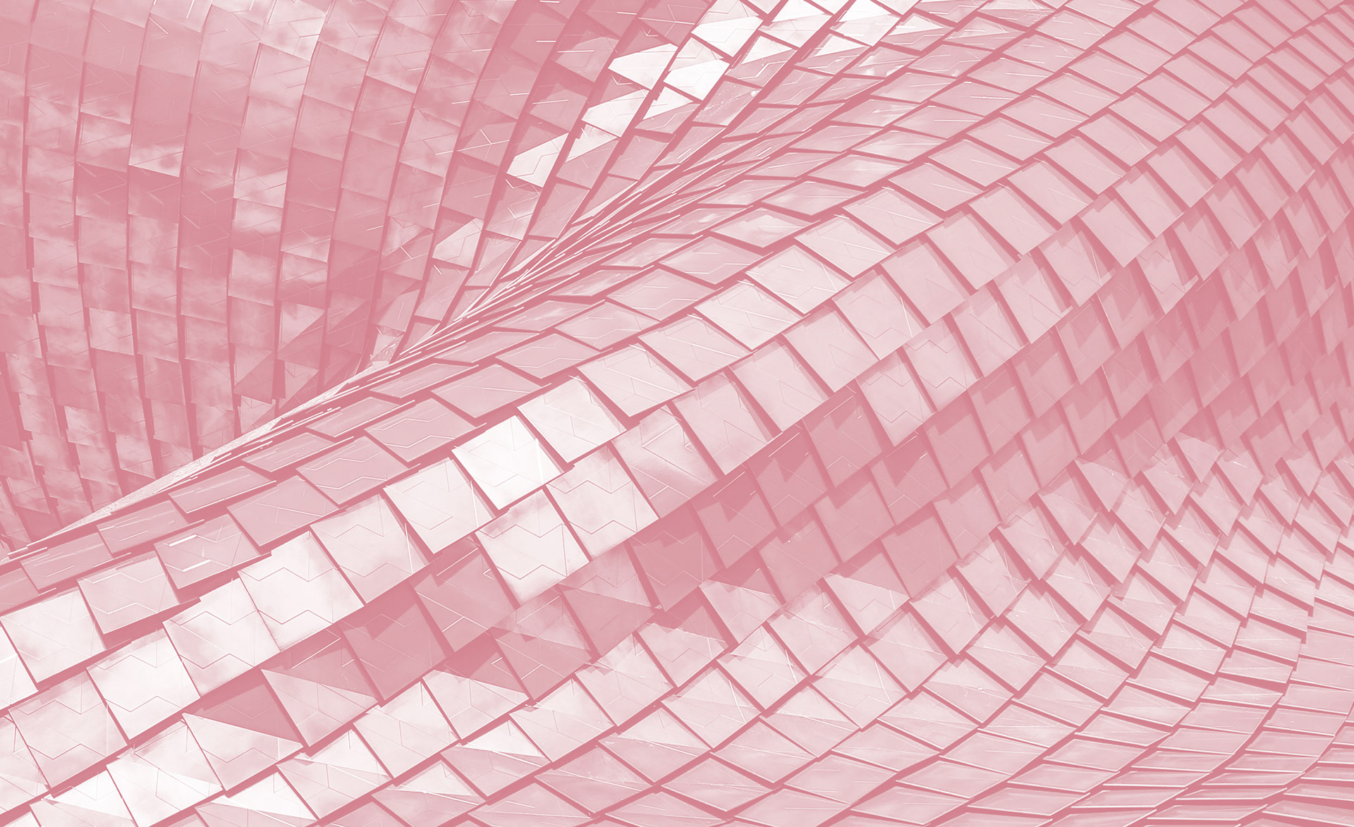
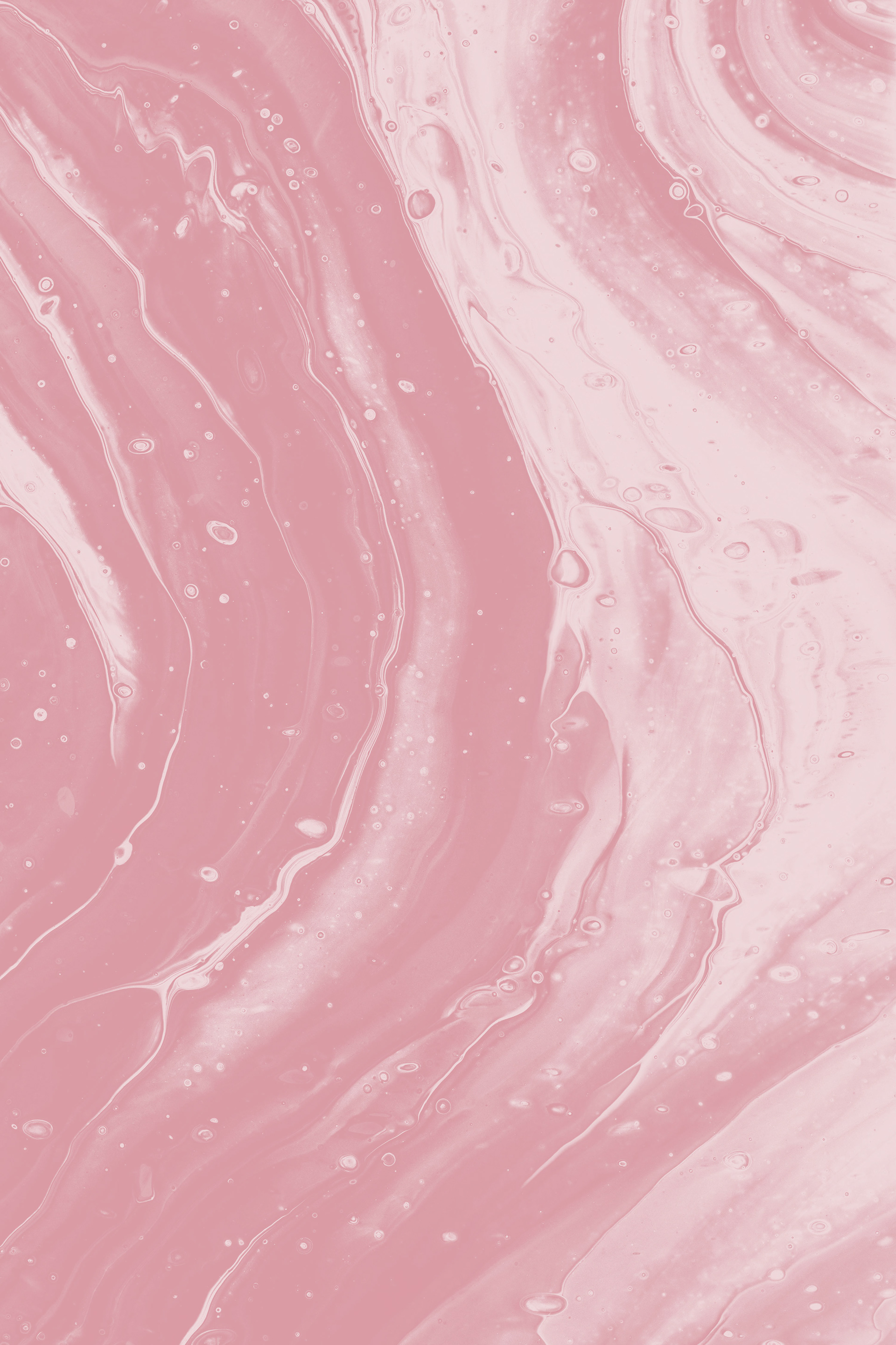
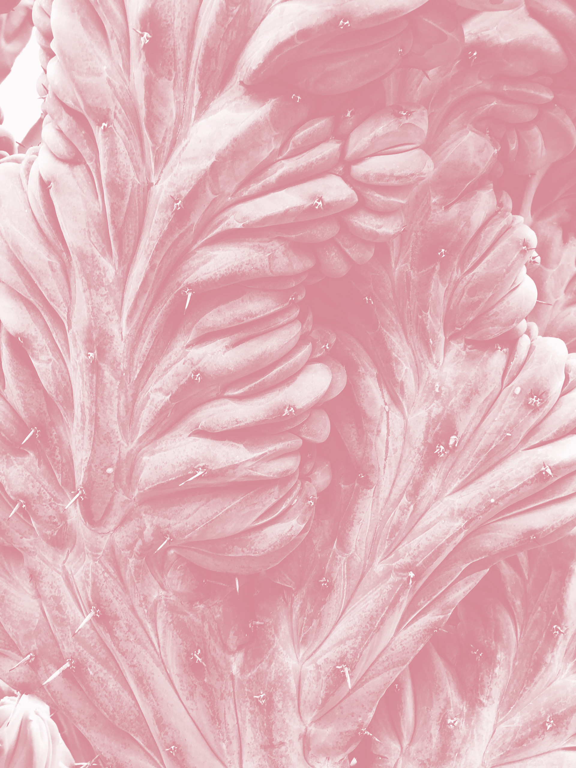
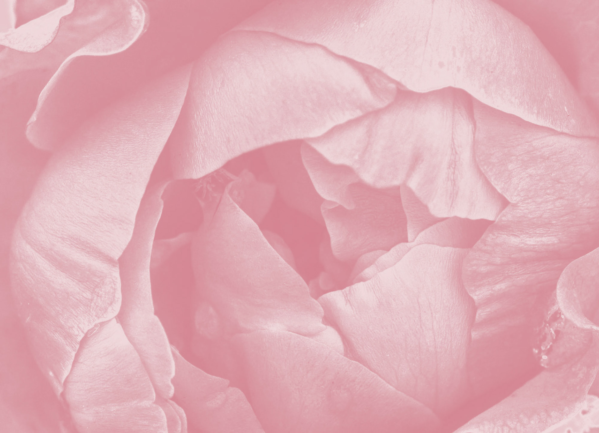
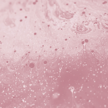
For the brand’s photography style, images with interesting shapes/forms were chosen. To keep the forms at the forefront, these were all made monotone in the brand’s primary colour so the bold colours of the images were not the main focus - the shapes in the images would become more present.
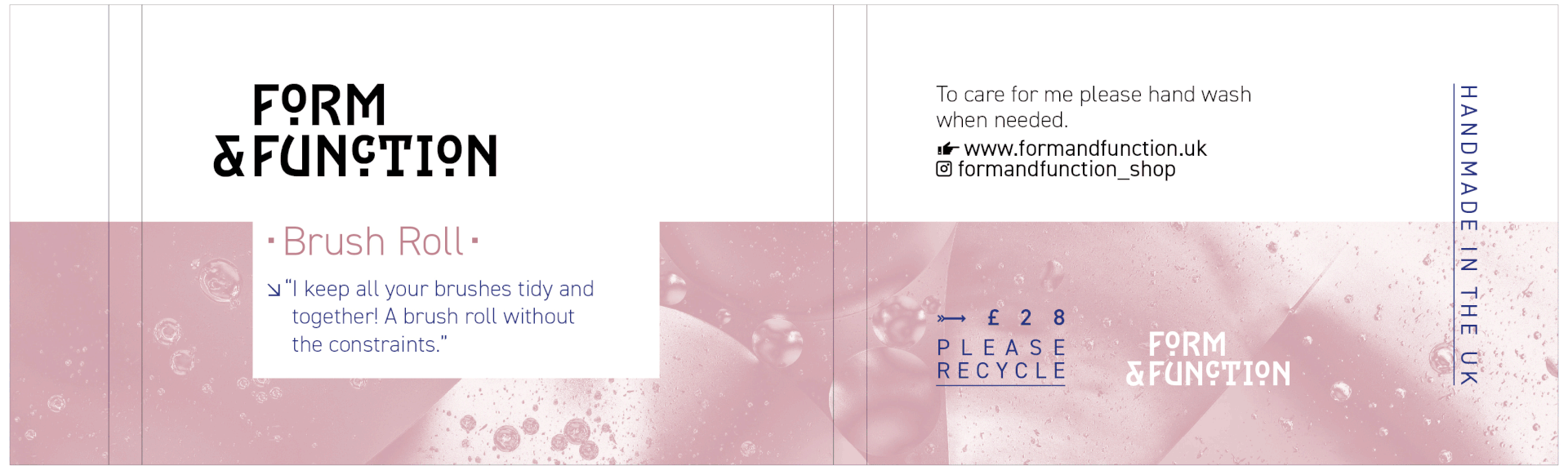
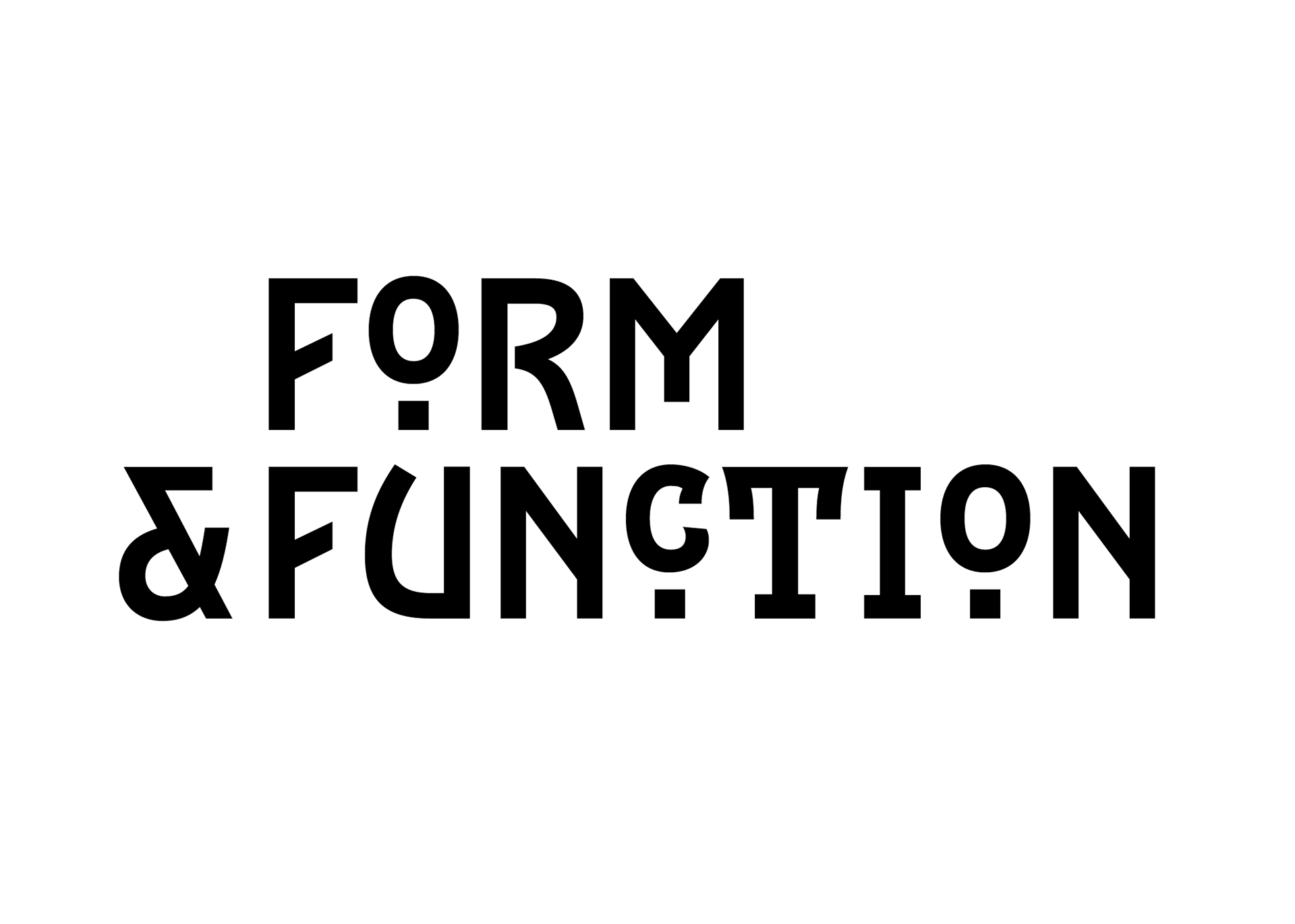
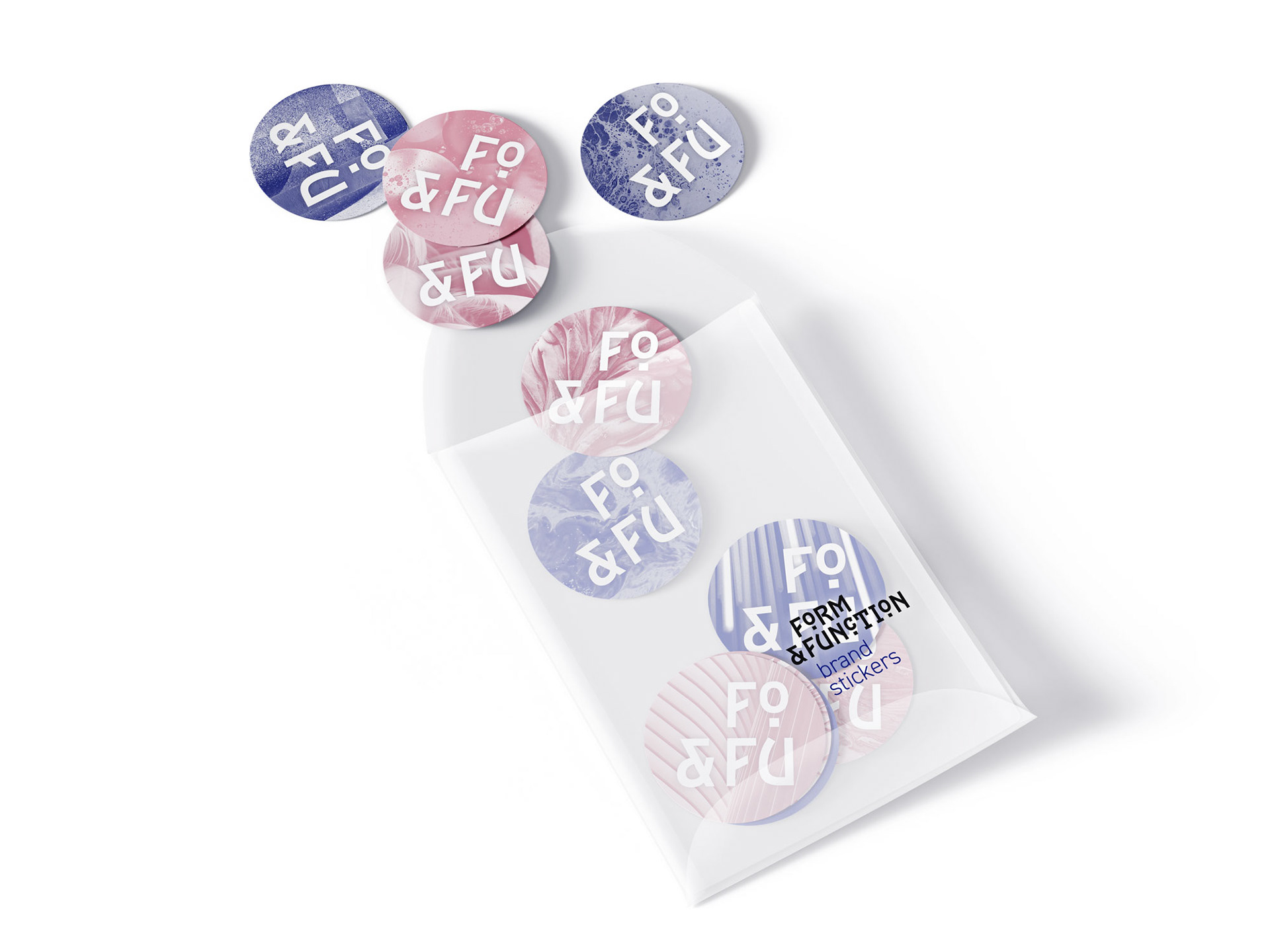
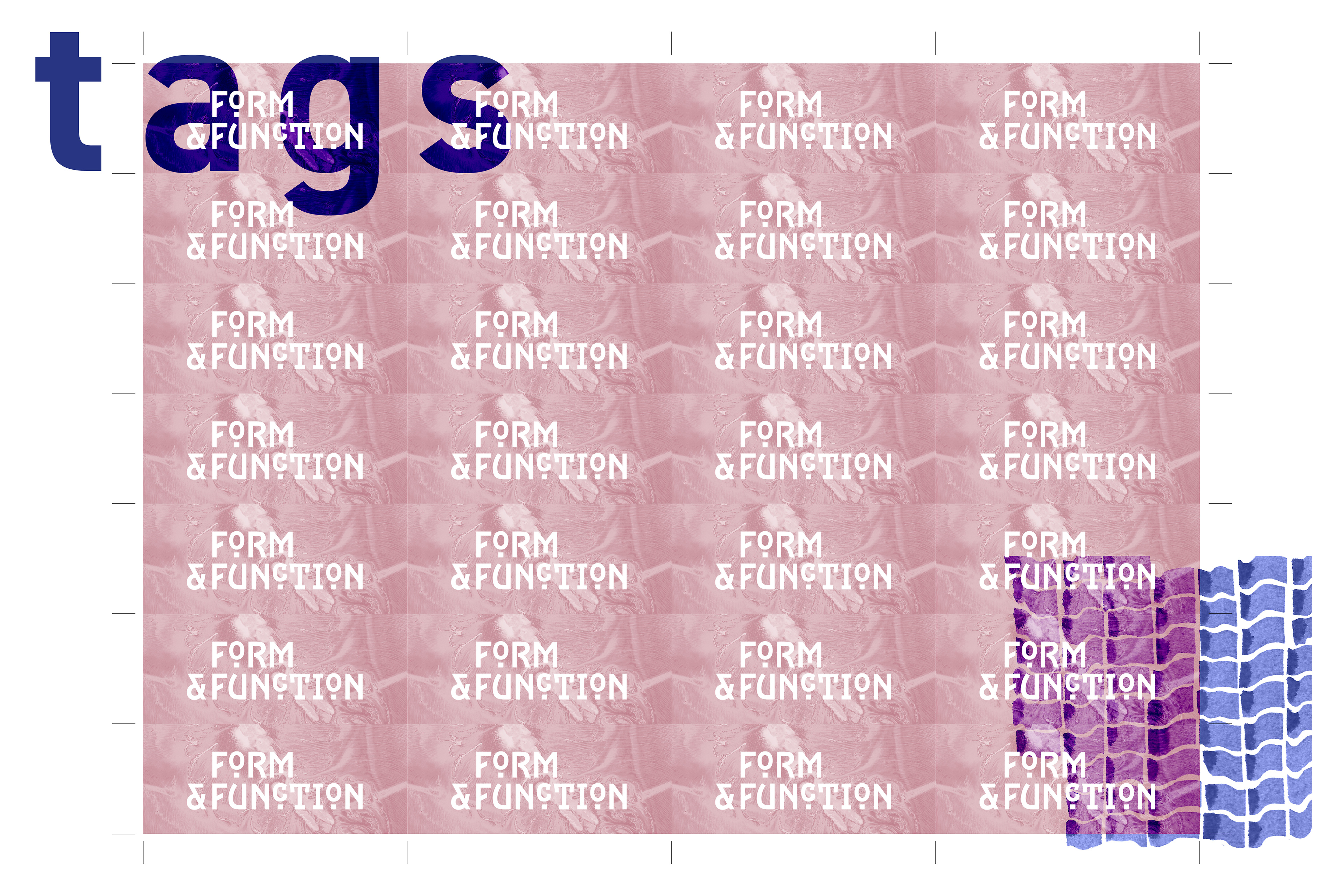
Logotype makes use of shapes & is itself a form by the placement & spacing with the ampersand to the left of the text. This then carries through onto other brand elements using the edge of the ‘F’s to align content below. Negative spaces to hold copy are cut out from the imagery to create shape/form aligning with the brand’s theme.

Logo Animation
Animated logo used to introduce the brand on social media, motion graphic aims to highlight the forms making up the typeface.
Belly Band Packaging
Examples of how the brand imagery is interchangeable on the product packaging.